Case Study - Brand design
CLIENT:
Kate Pincott,
CEO & Design Coach at Reality Prototyping©
CEO & Design Coach at Reality Prototyping©
TIMELINE:
DELIVERABLES:
Complete redesign of the brand and coaching program, including brand identity and positioning, marketing and website design.
August 2022 - March 2023
Role
Tools
Skills
Figma, Webflow, Photoshop, Illustrator, Notion, Loom, Slack, Trello
Webflow, LinkedIn,
Twitter, Email
Twitter, Email
platforms
Brand Designer
Web Designer
Web Designer
Web Design, UI Design, Layouts, User Research, Market Research, Brand Strategy, Usability Testing
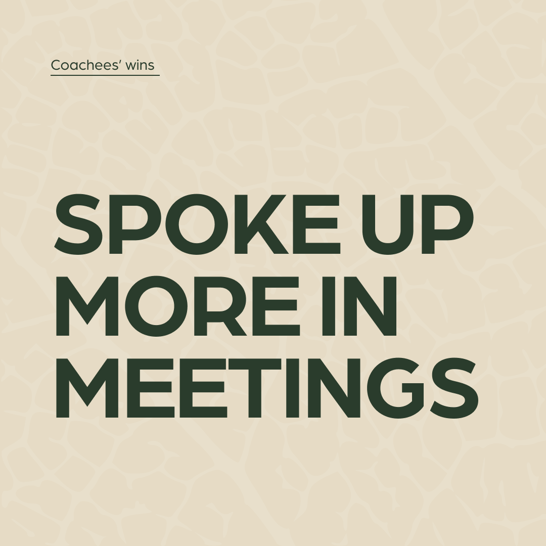
Design Coaching Program Rebrand
Reality Prototyping© is a self-paced coaching program for Product Designers to level up in their careers by prototyping themselves through a 3 step framework to increase self-awareness, confidence and ultimately product impact by doing meaningful work.
The program was created by Kate Pincott, a Design Manager and an ICF Certified Coach. After working closely together on various projects, Kate entrusted me with the rebranding of her business and leading this project.
The program was created by Kate Pincott, a Design Manager and an ICF Certified Coach. After working closely together on various projects, Kate entrusted me with the rebranding of her business and leading this project.
Brief
To research and study the coaching and design education market,
Review the mission, vision, and identity of the Reality Prototyping© program,
Apply the findings to visually evolve the brand from its previous iteration across all channels, e.g. website, marketing assets and course materials.
Review the mission, vision, and identity of the Reality Prototyping© program,
Apply the findings to visually evolve the brand from its previous iteration across all channels, e.g. website, marketing assets and course materials.
Goal
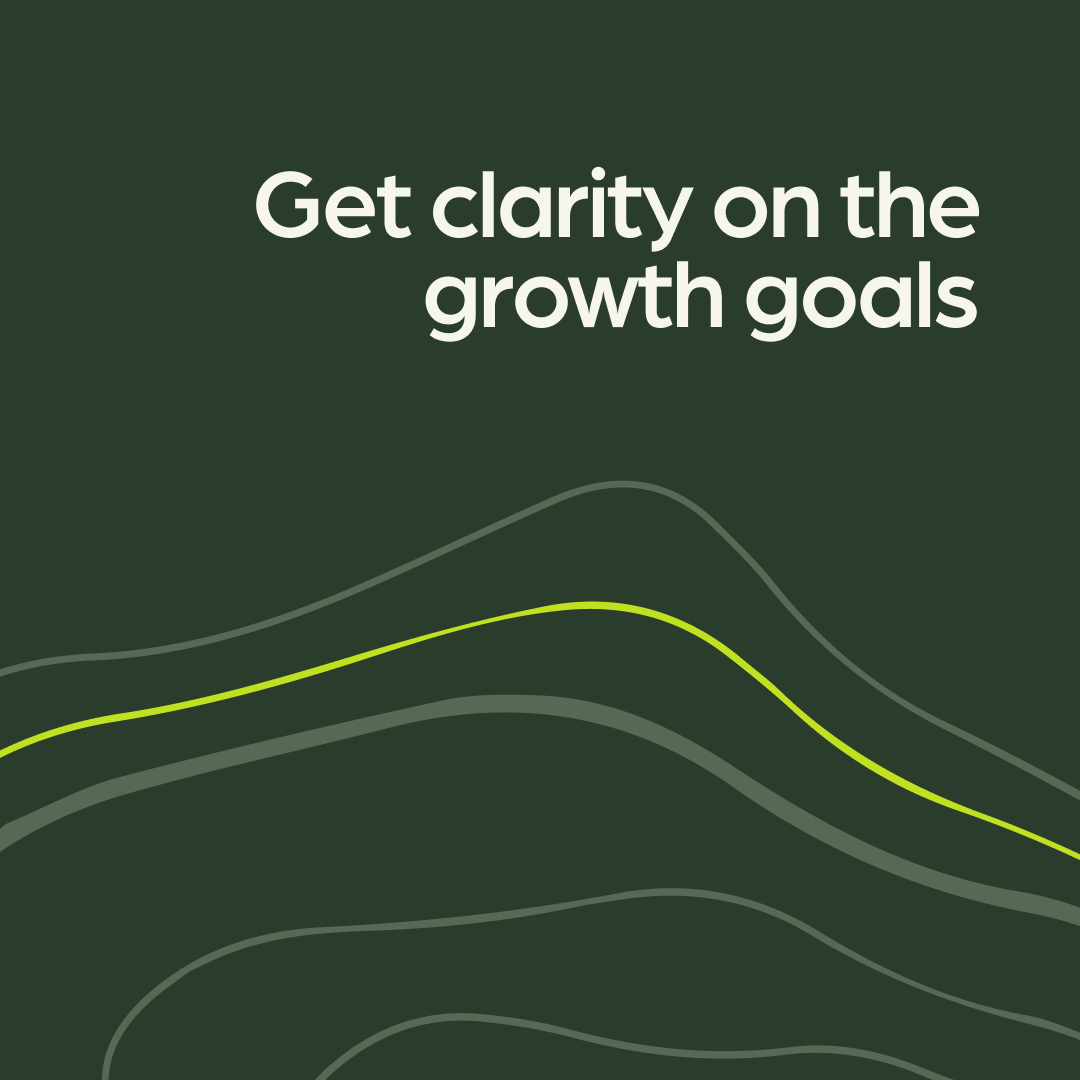
With Reality Prototyping© being a B2C business, the goal was to increase awareness of the program among the Product Design community by aligning brand strategy to business strategy and creating more engaging visuals and interfaces.
Vision
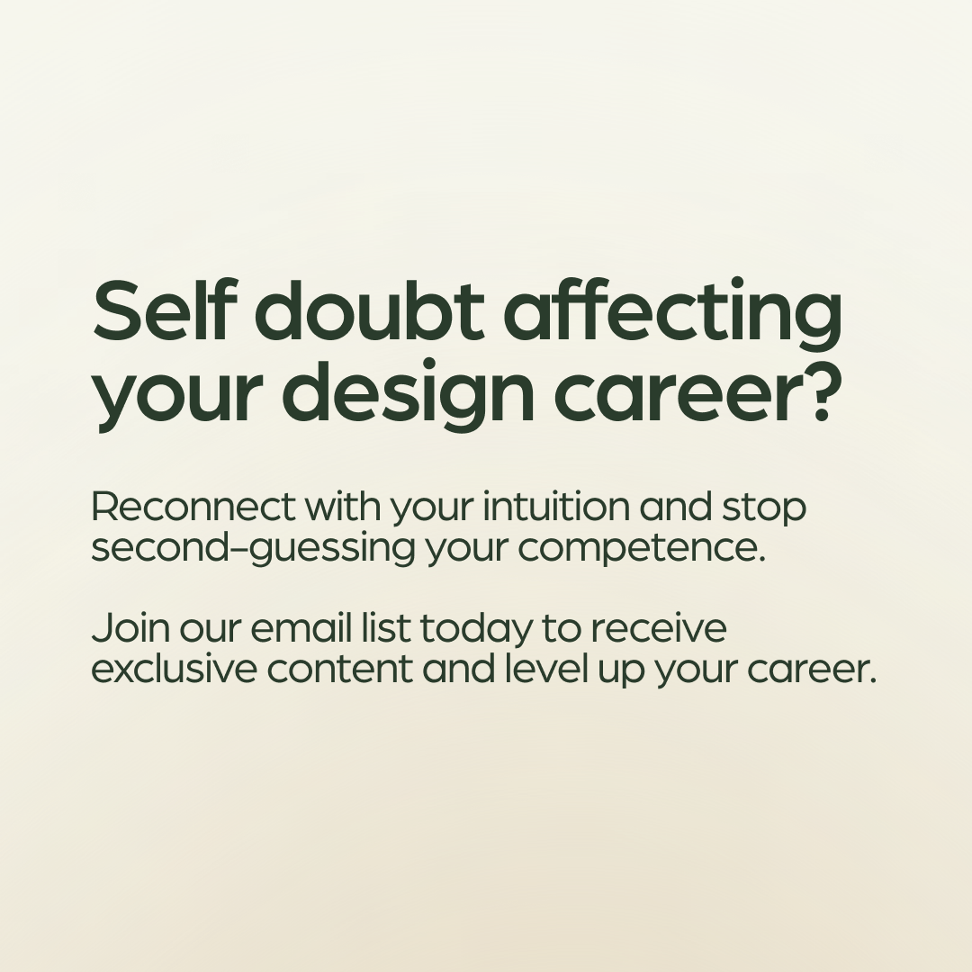
To empower Product Designers to listen to their inner wisdom, to trust their intuition, alongside data, so that they can increase their product influence, income and social impact through continuous self-discovery.
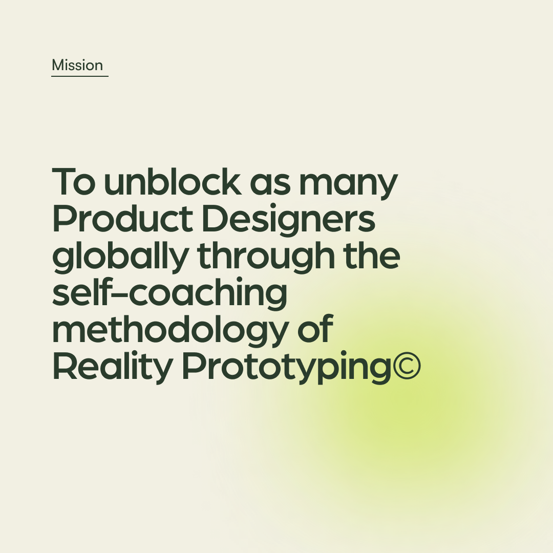
Mission
To be the most effective continuous self-discovery program for Product Designers to develop their self-awareness, confidence and an experimental mindset.
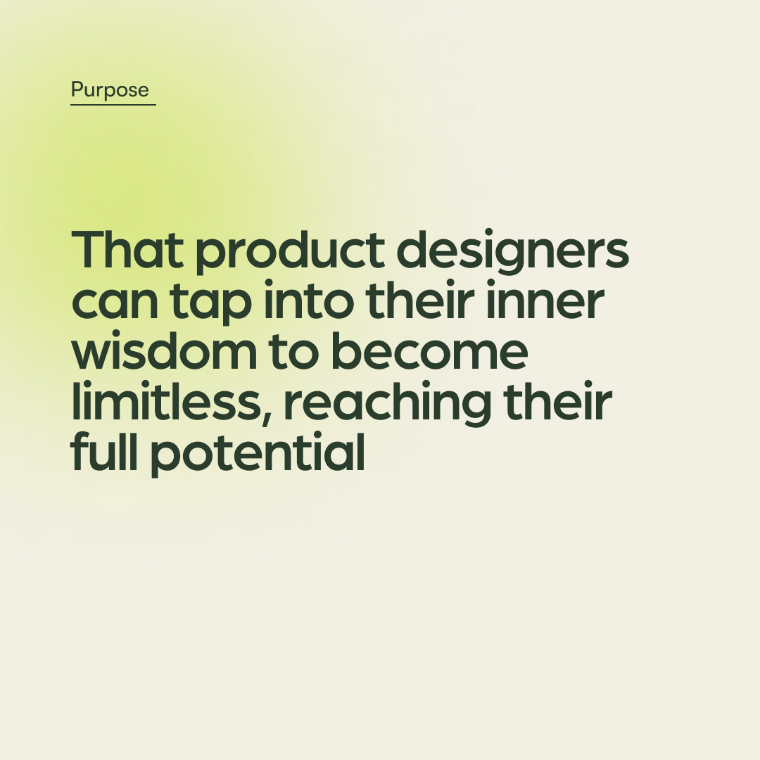
Purpose
We believe the next generation of Product Designers can solve the climate crisis through gut-led design.
To empower Product Designers to listen to their inner wisdom, to trust their intuition, alongside data, so that they can increase their product influence, income and social impact through continuous self-discovery.
Mission
To be the most effective continuous self-discovery program for Product Designers to develop their self-awareness, confidence and an experimental mindset.
Purpose
We believe the next generation of Product Designers can solve the climate crisis through gut-led design.
Brand Statement
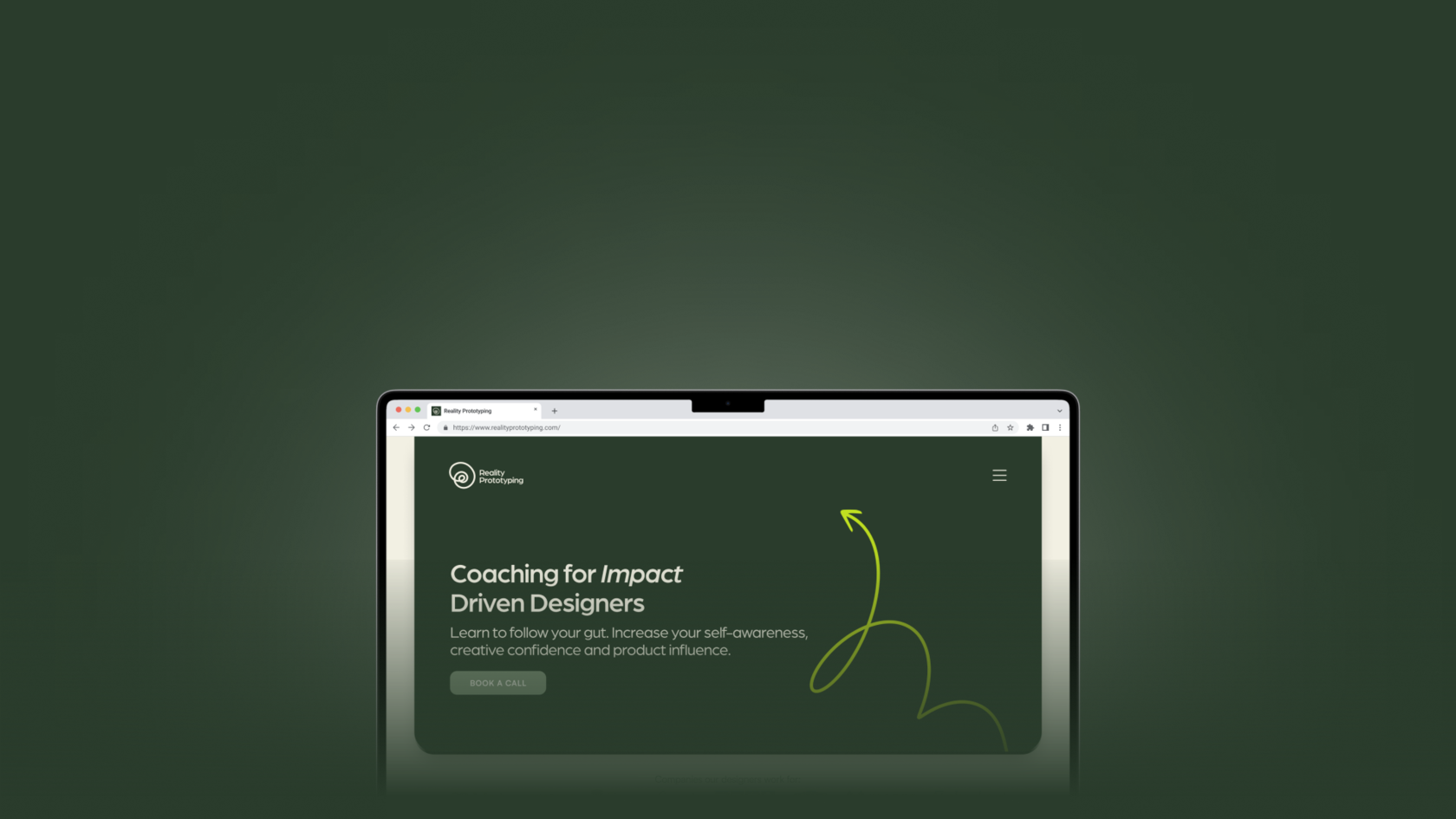
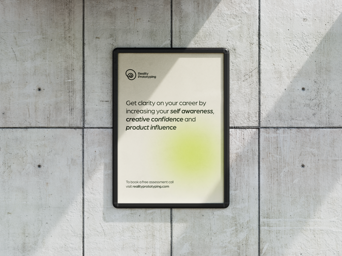
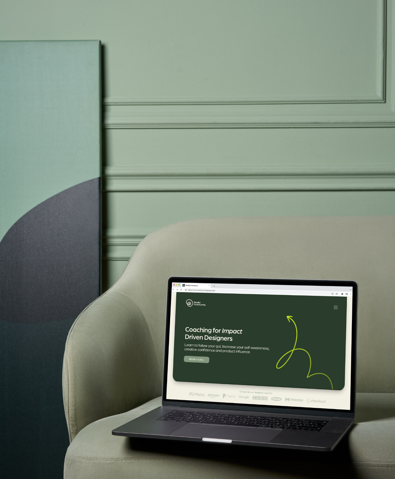
Intuition-Led Coaching for Impact Driven Designers
Learn to follow your gut. Increase your self awareness, creative confidence and product influence.
Learn to follow your gut. Increase your self awareness, creative confidence and product influence.
The Brand
Brand Values
Intuition
Trust your gut, trust yourself and let it be your guide.
Incomparable
You are enough just as you are, you don’t have to adjust yourself to the voices around you.
Continuous Experimentation
Being open to new things and learning instead of being stuck in your old ways. Change happens in small steps.
Trust your gut, trust yourself and let it be your guide.
Incomparable
You are enough just as you are, you don’t have to adjust yourself to the voices around you.
Continuous Experimentation
Being open to new things and learning instead of being stuck in your old ways. Change happens in small steps.
Billboard mockup for Reality Prototyping ad
Creative Strategy
In the first stage of this rebranding project, I analyzed what people think about design coaching and how to convey to designers that being an impactful designer is not a linear path and that many answers lie within soft skills.
By conducting user and market research, learning about the brand through detailed questionnaires, studying metaphors and associations and implementing the findings in many rounds of iteration and feedback, I was able to communicate the mission of the brand through visual identity design.
Brand Archetype: Guide
Keywords: Self-Discovery, Inner-growth, Gut
Audience’s feelings: Purpose, Clarity, Freedom
Creative Strategy
Kate (the client) and I have closely collaborated on diving deeper into the meaning and purpose of the program, and what emotions, associations and actions we wanted students to experience.
The result was discovering 3 symbolisms to parallel the business model:
The result was discovering 3 symbolisms to parallel the business model:
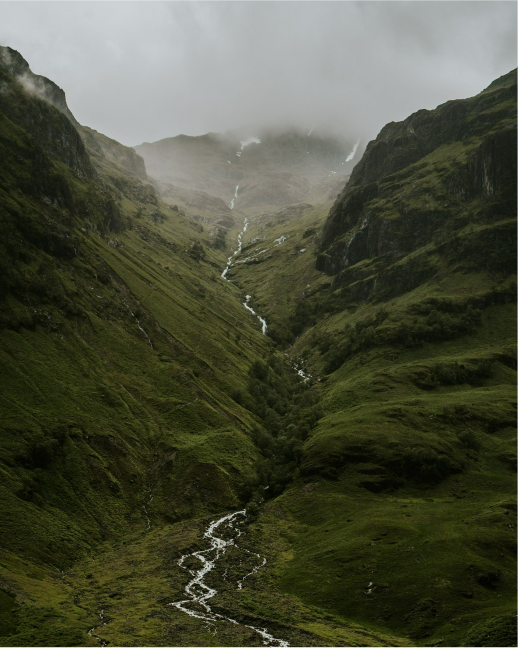
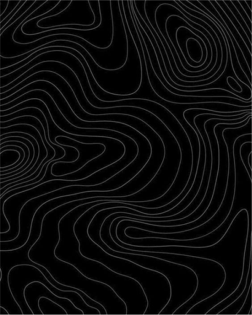
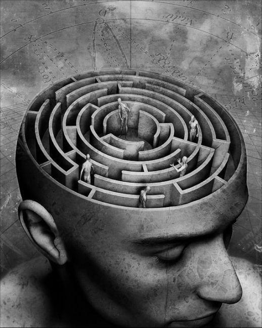
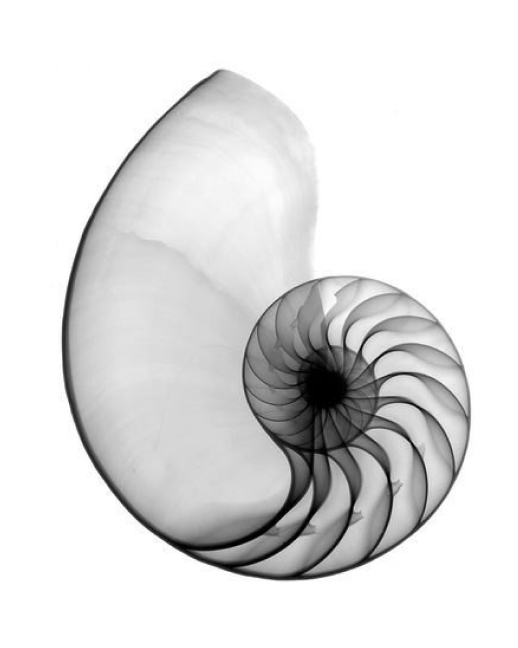
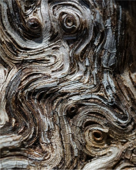
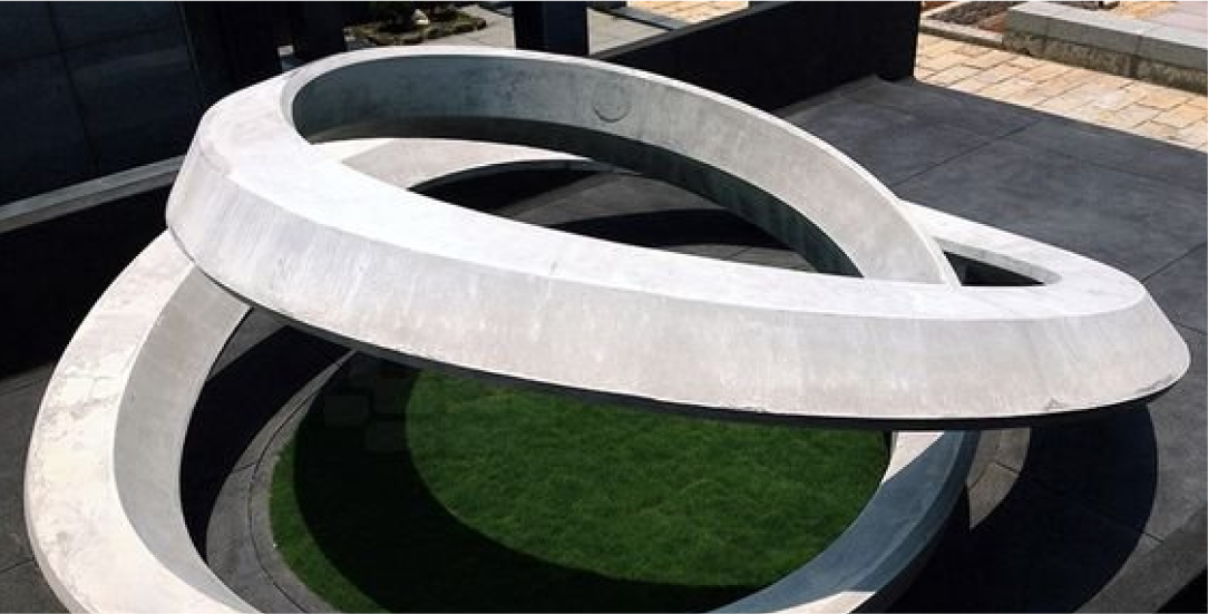
- an upward spiral - for continuity and growth,
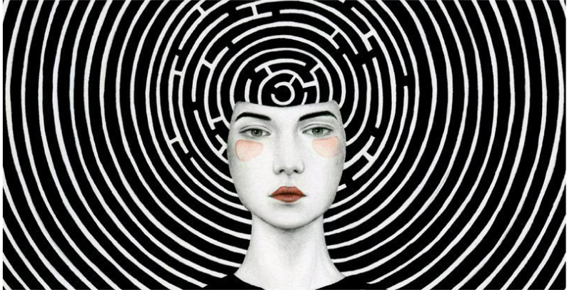
- maze - for non-linear journey and curiosity,
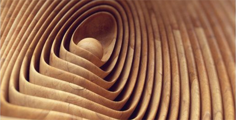
- nature - recognizing unique but familiar patterns
Creative idea
The project consisted of 4 main phases:
As a lead on this project, I coordinated with my client and other team members to have regular updates on Slack and bi-weekly brainstorming and review sessions.
- Brand research and strategy
- Design direction and visual identity
- Marketing Assets design
- Website design
As a lead on this project, I coordinated with my client and other team members to have regular updates on Slack and bi-weekly brainstorming and review sessions.
Look and feel
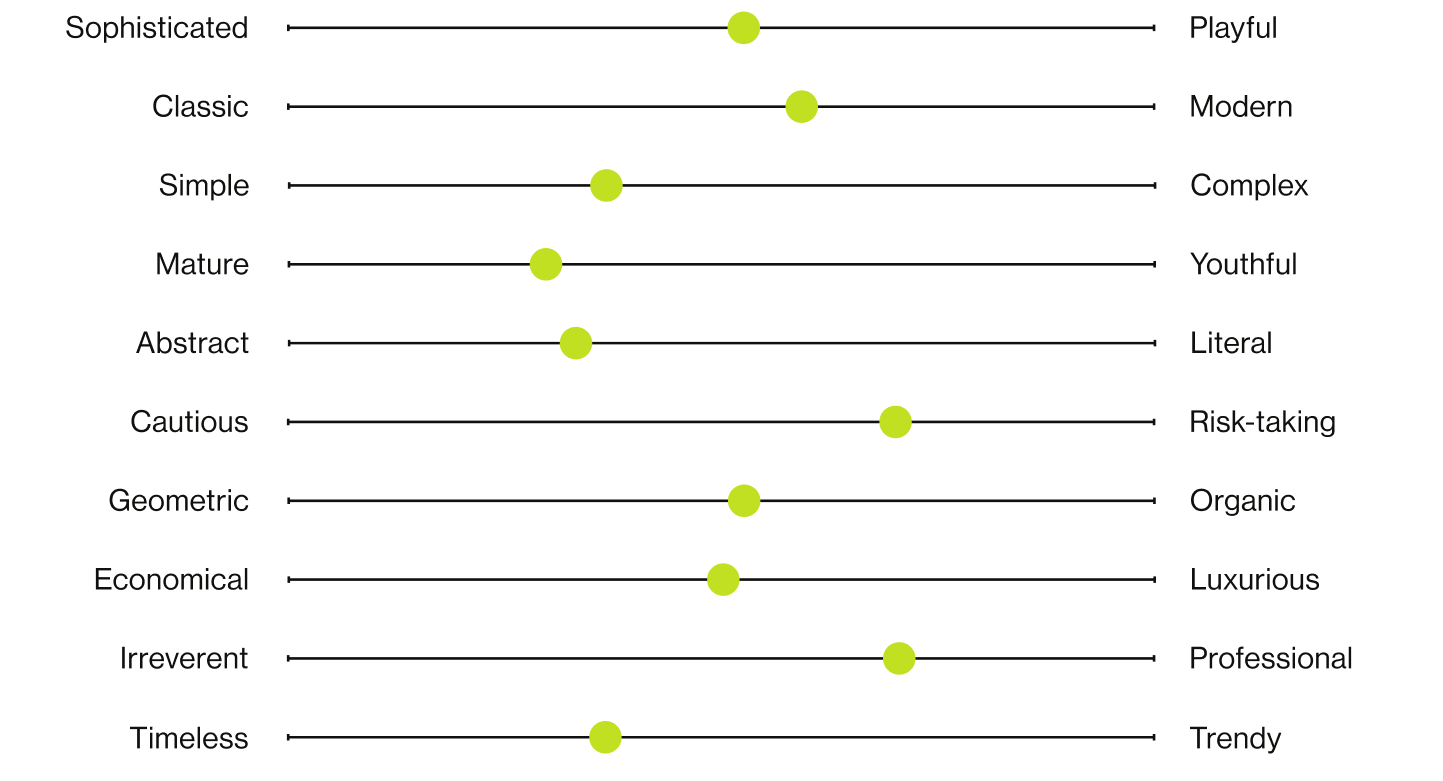
Moodboard

Early Logo and design direction exploration
Early Logo and design direction exploration
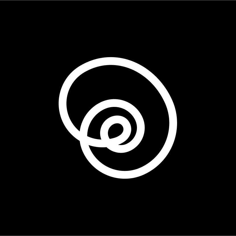

Logo anatomy
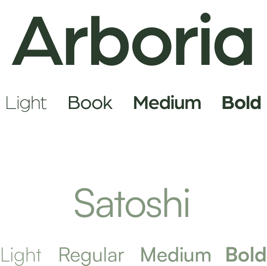
Fonts
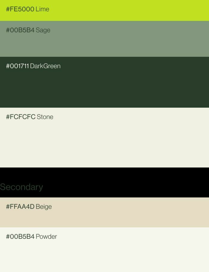
Primary colour pallet
Secondary colour pallet
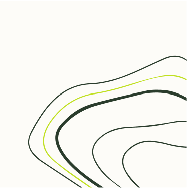
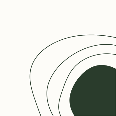
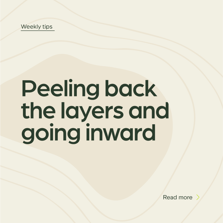
Graphic elements
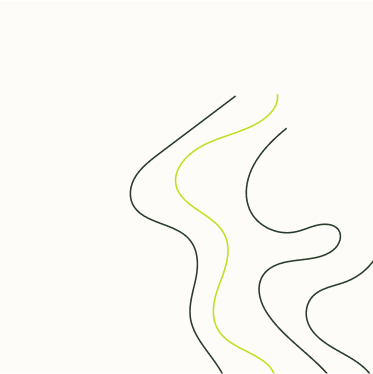


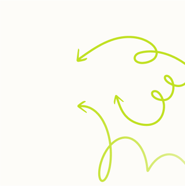
Tree rings
Use: marketing assets
Why: refers to nature metaphors used in the program
Use: marketing assets
Why: refers to nature metaphors used in the program
Ripple circles
Use: marketing assets
Why: a metaphor for progress and growth
Use: marketing assets
Why: a metaphor for progress and growth
Winding path
Use: marketing assets
Why: reference to a non-linear nature of growth and success
Use: marketing assets
Why: reference to a non-linear nature of growth and success
Beige gradient
Use: marketing assets
Use: marketing assets
Lime gradient
Use: marketing assets
Use: marketing assets
Progress arrows
Use: banners and website
Why: the graphic element to reflect levelling up
Use: banners and website
Why: the graphic element to reflect levelling up
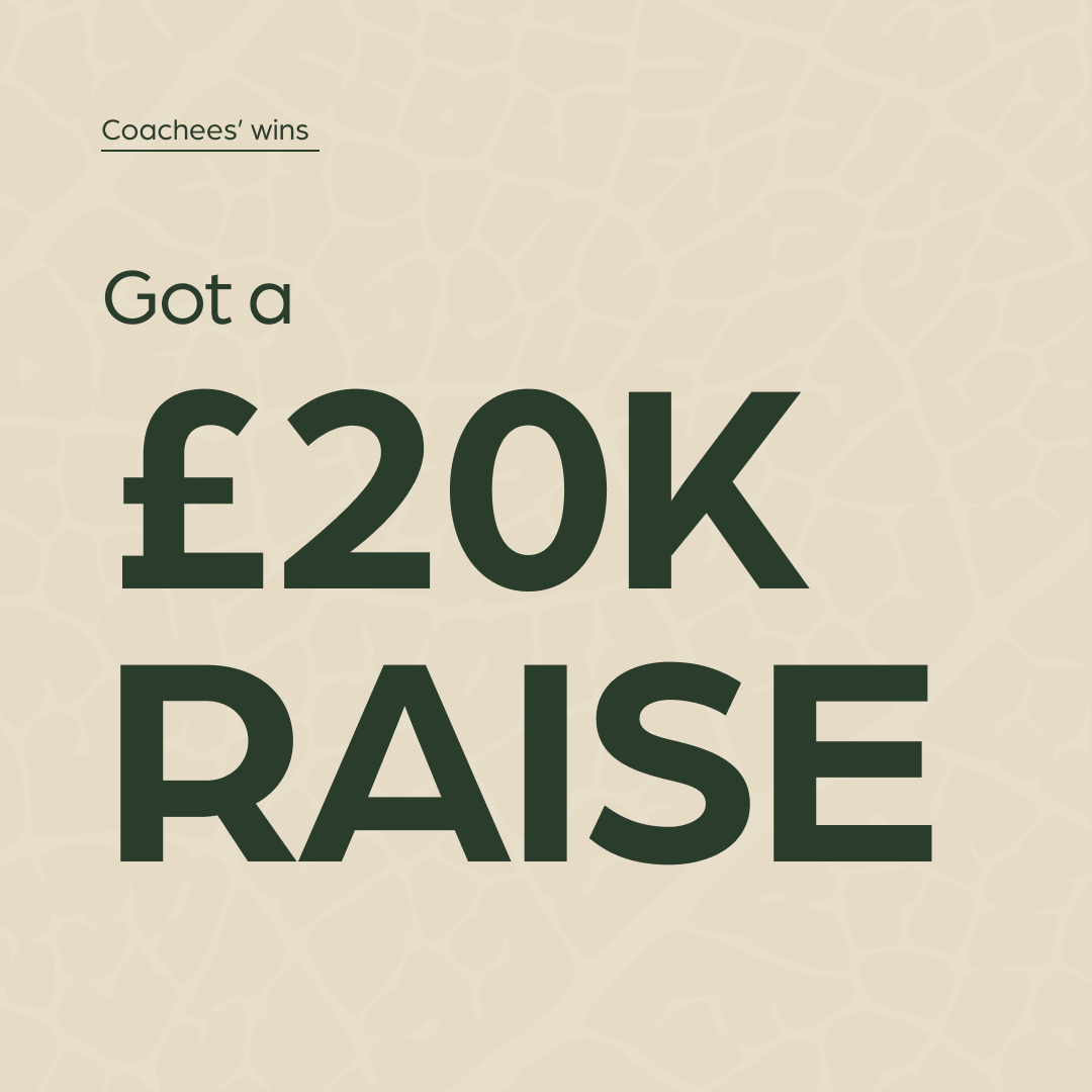
Social media templates
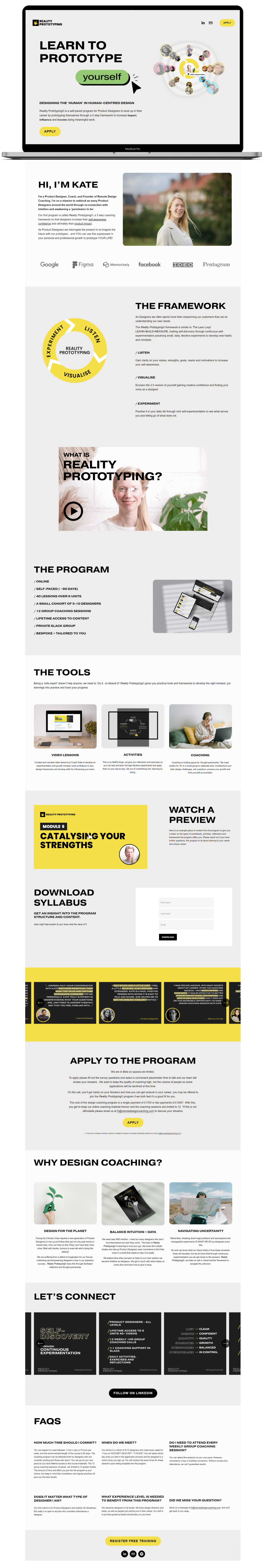
Mobile landing page
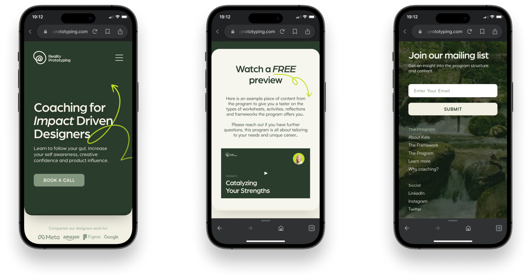
landing page
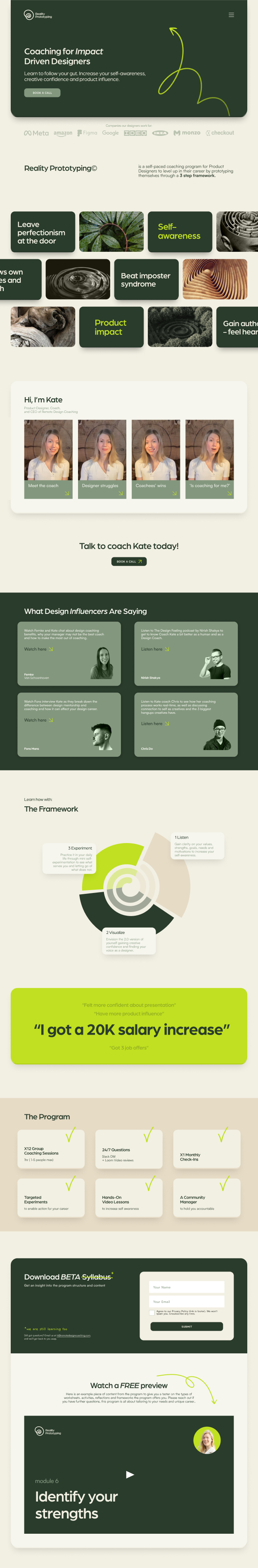
Before
After
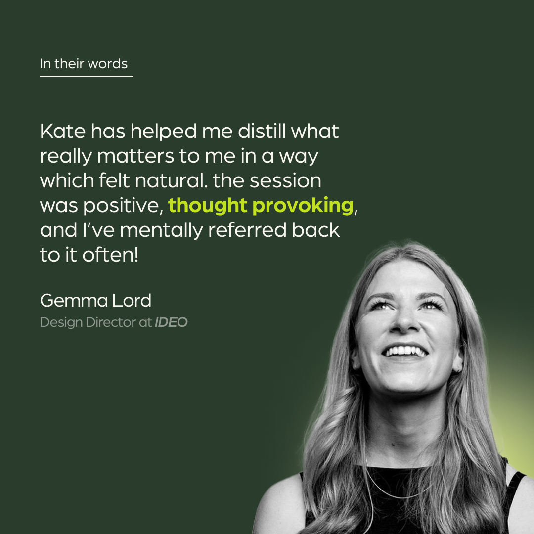
Client feedback
Elena took on the daunting task of designing a website for a designer. I'm super happy with her work and feel the new brand represents the direction I wish to go into much better!
Elena designed my re-brand and website with thoughtfulness, open curiosity and perseverance. She has a can-do attitude, with a positive mindset, always maintaining good communication with me. When we needed to make a pivot Elena went the extra mile to nail it quickly! She embraced user feedback and iterated effectively in response.
I highly recommend working with Elena as a loyal, growth hungry and reliable designer with a great future ahead of her.
Founder and CEO of Reality Prototyping
KATE PINCOTT
